| Home | InDesign Work | Photoshop Work | Contact Me |
|
| The logo I designed for the Graphic Designs company is simple, but eye-catching and dynamic. Because graph design involves computer work, I made a cursor. The cursor is like the paint brush in the art of graphic design. So I drew arching red lines across it, as if the cursor had paint on it. I then added diagonal lines coming from just in front of the point of a cursor, as if it were clicking down on something. These lines give it movement and action, making the logo very dynamic and eye-catching. Then I used a very bold-faced font to write the company name. I filled in the letters with red so that the company name would stand out and be memorable to those that saw the logo. Finally, I dropped a subtle shadow below the lines, cursor, and letters on the logo to really make it pop off the page. The three-dimensionality that this adds also makes it look more sophisticated in my opinion. This logo was then added to a business card, a letterhead, and an envelope. |
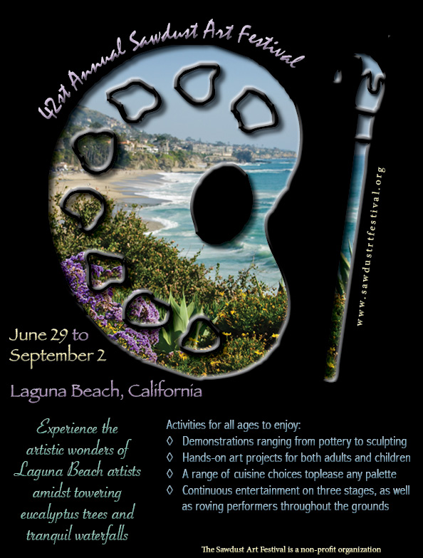
| For the art festival poster project, I wanted to use the cutting technique learned in class for the jazz festival poster. I took a picture of Laguna Beach, since the festival occurs there annually, and then chose some colors for swatches from the image. Then, since it is an art festival, I thought an artist's palette would be an appropriate pairing with the beach. Using the cutting technique, I was able to make it look like those viewing the poster were looking though a window out at Laguna Beach, "amidst towering eucalyptus trees and tranquil waterfalls" like the description stated. I then beveled the edges of the palette so that the paint blotches look more like a loquid or paint! I included the necessary information using the colors I had added to the swatches. I typed on a path to make the curved title of the festival. I tried to place the other text in a way that wasn't cluttered, but grabbed the attention of the viewer. Including the website, which I placed paralleling the paint brush beacuse I thought it was subtle enough not to interupt the artistic nature of the picture, but prominent enough that people would notice and remember it after seeing the poster. |
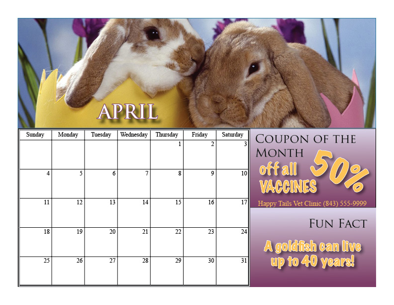
| I created this layout because I thought it used space most efficiently for pictures, days of the month, a fun fact, and a coupon. I chose to design months based off of holidays. For example, the month shown here is April: Easter Time! I thought the picture of the bunnies in the Easter eggs was very appropriate and bright for spring. The colors match the pictures for each corresponding month. Some areas of the month or texts have dropped shadows for emphasis. I tried to use good line variation as well. And properly size and fit each image in it's appropriate box. Overall, I think the calendar has a very clean, organized feel. I worked hard not to make it too busy, and not make it too boring. The text stands out, but doesn't outdo the images for each month. Using the master page feature in InDesign helped a lot with efficiency and making sure each page was laid out the same way. I really enjoyed this project. |
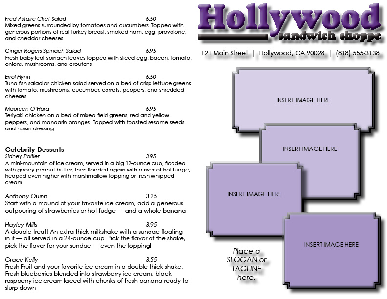
| For my menu design, I focused on a very simple, minimalist design that was also sophisticated and elegant. I started by beveling and embossing the logo to create emphasis via three-dimensionality. I also dropped a shadow to aid this effect. This makes the logo really pop off the page. I also wanted to create many options for images on the cover, whether they are of menu items or photos of the location and inside the restaurant. I added minimal black borders, with "fancy" corners for elegance. I overlapped each box on top of one another for dynamism and dimensionality. Then I filled each box with a different shade of purple to match the logo, only because I wanted my layout to look professional and complete when presented to the shoppe’s owner. I also left space for a slogan, quote, or tagline. On the inside, I made space for two images, one specifically for the special of the month like the restaurant requested. |